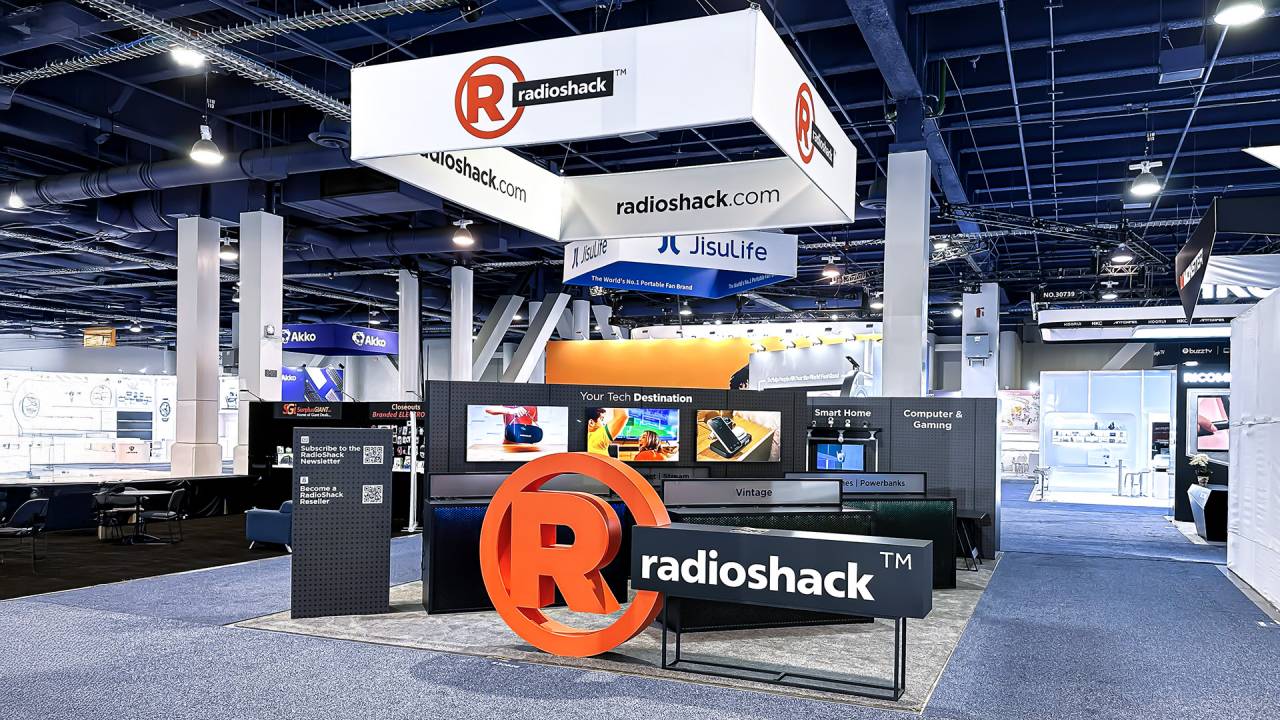
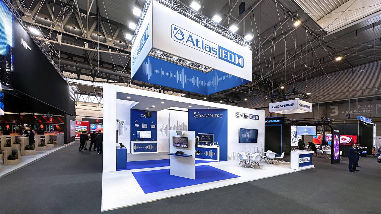
RadioShack’s booth showcased a refreshed product lineup through open design and clear sightlines, presenting solutions for everyday use. Bold branding and clean layouts ensured strong visibility and intuitive navigation.
Structured zones and interactive displays highlighted practical, well-designed technology, while the modern, confident design supported business dialogue—positioning the booth as a platform for product discovery and future-focused solutions.
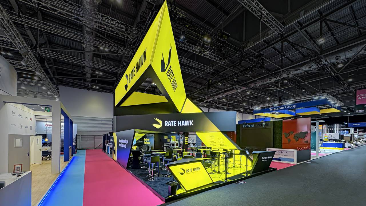
The centerpiece of the stand was a beam of light cutting through darkness, symbolizing power, energy, and inspiration, akin to a superhero’s impulse. This dynamic path symbolized RateHawk’s mission to elevate clients’ businesses to new heights.
The beam came alive with dynamic backlighting in lightboxes. The illumination flowed from the reception across the floor, up the walls, through a large video wall, and into the ceiling fixture.
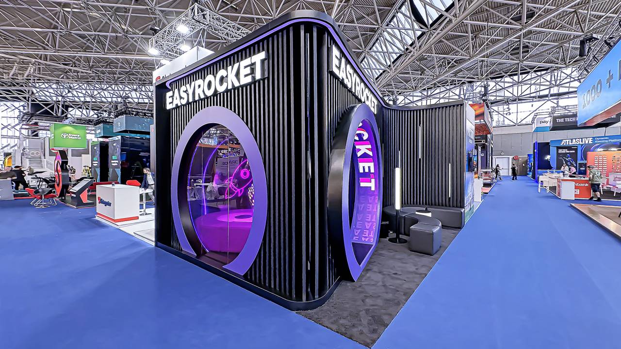
The stand combined a futuristic design with a cozy and functional interior space, creating an inviting and innovative environment for visitors. The mirrored wall behind the bar visually expanded the space, making the interior feel more open and dynamic.
The media arch at the entrance was a key design element, which highlighted the futuristic concept, attracting attention and creating a memorable impression.
Unique architectural forms defined the exhibit space, creating a visually striking and memorable presence that captured attention across the show floor. Thoughtfully designed layouts optimized visitor flow and maximized engagement throughout the stand.
Engaging on-stand activities, including interactive demonstrations and hands-on experiences, attracted attendees, encouraged active participation, and enhanced overall visitor experience.
Innovative multimedia solutions captured attention and fully immersed visitors, while the uniquely shaped screen enhanced visual storytelling and elevated content delivery.
Elegant architecture seamlessly integrated with advanced technology, creating a refined, high-impact environment that balanced visual appeal with functionality and strengthened the overall brand experience.
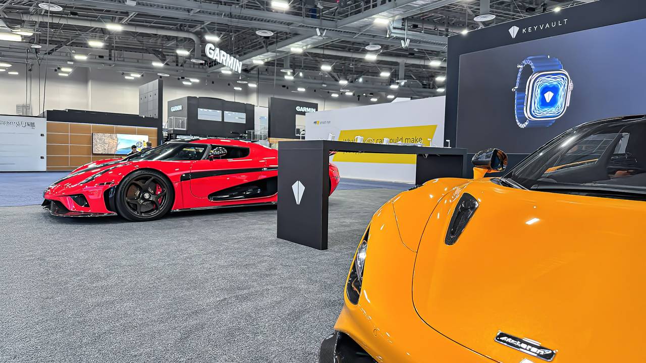
Keyvault’s booth showcased its innovation through a bold, product-focused environment. Premium sports cars and a central demo zone visually translated the idea of transforming any vehicle into a smart, connected system.
A large-scale screen and clean architectural structure reinforced the message of control, security, and seamless connectivity, positioning the brand as a forward-thinking solution in the evolving automotive tech landscape.
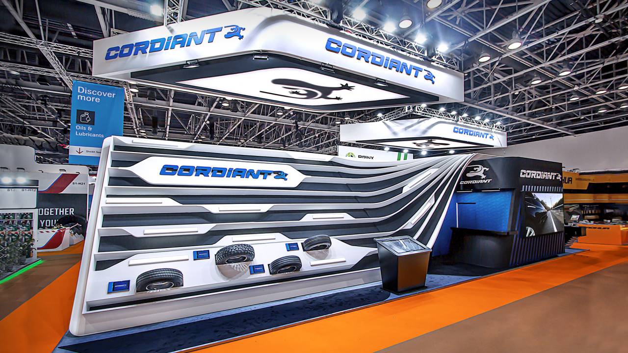
The Cordiant stand embodied the concept of movement and technological progress. Its core idea was a road that seamlessly flowed from one zone to another, symbolizing the brand’s diverse product range.
An overhead media structure with the logo and an animated gecko added interactivity to the stand. Digital screens, illuminated information panels, and a touchscreen kiosk provided easy access to key product details.
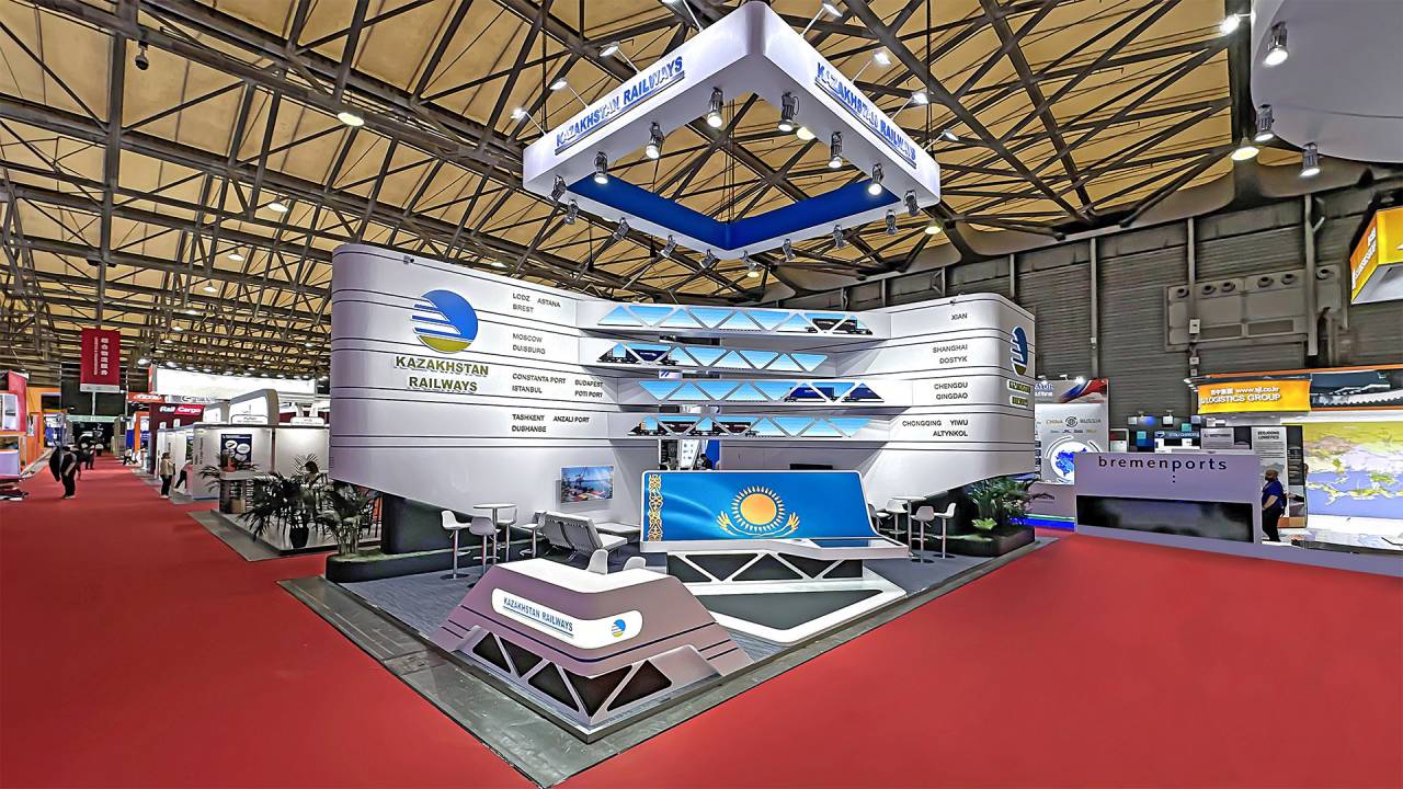
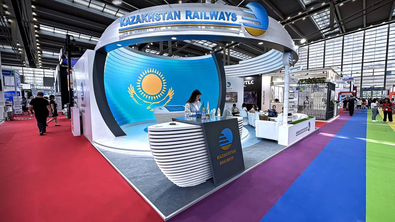
The Kazakhstan Railways exhibition stand highlighted the country’s vital role in connecting East and West. Two large elements symbolized the continents, linked by railway routes showcasing key cities and logistics hubs.
Designed in an industrial style with metal and clean lines, the stand conveyed reliability and innovation. A blue and white palette reinforced professionalism, while green accents added vibrancy, creating a dynamic experience.
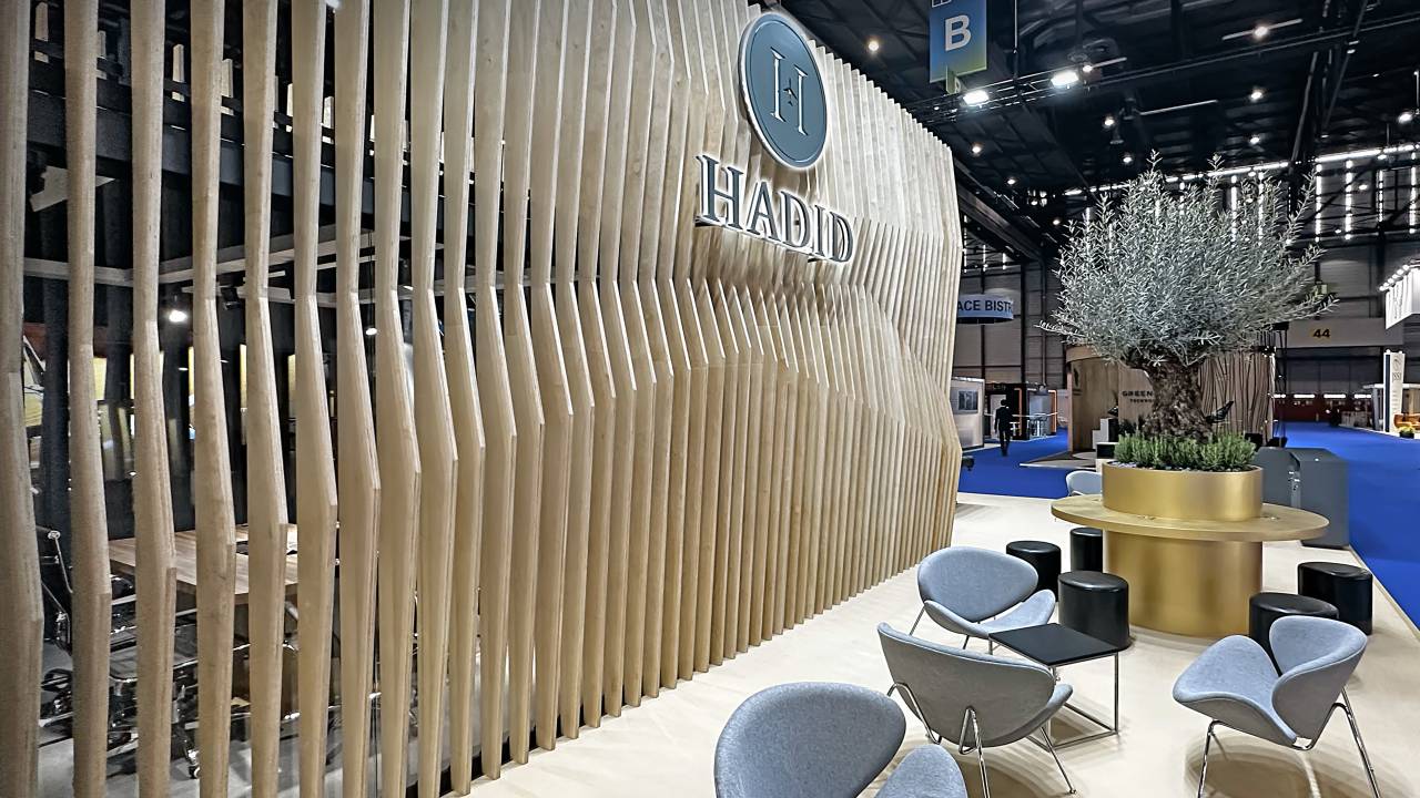
The stand reflected HADID’s reputation through a blend of elegance, stability, and comfort. A striking wooden slat structure stood at its core, symbolizing reliability and strength. A modern lounge and conference room provided space for meetings and networking.
A standout feature—the olive tree—was seamlessly integrated into the design, reinforcing the brand’s commitment to sustainability and innovation.
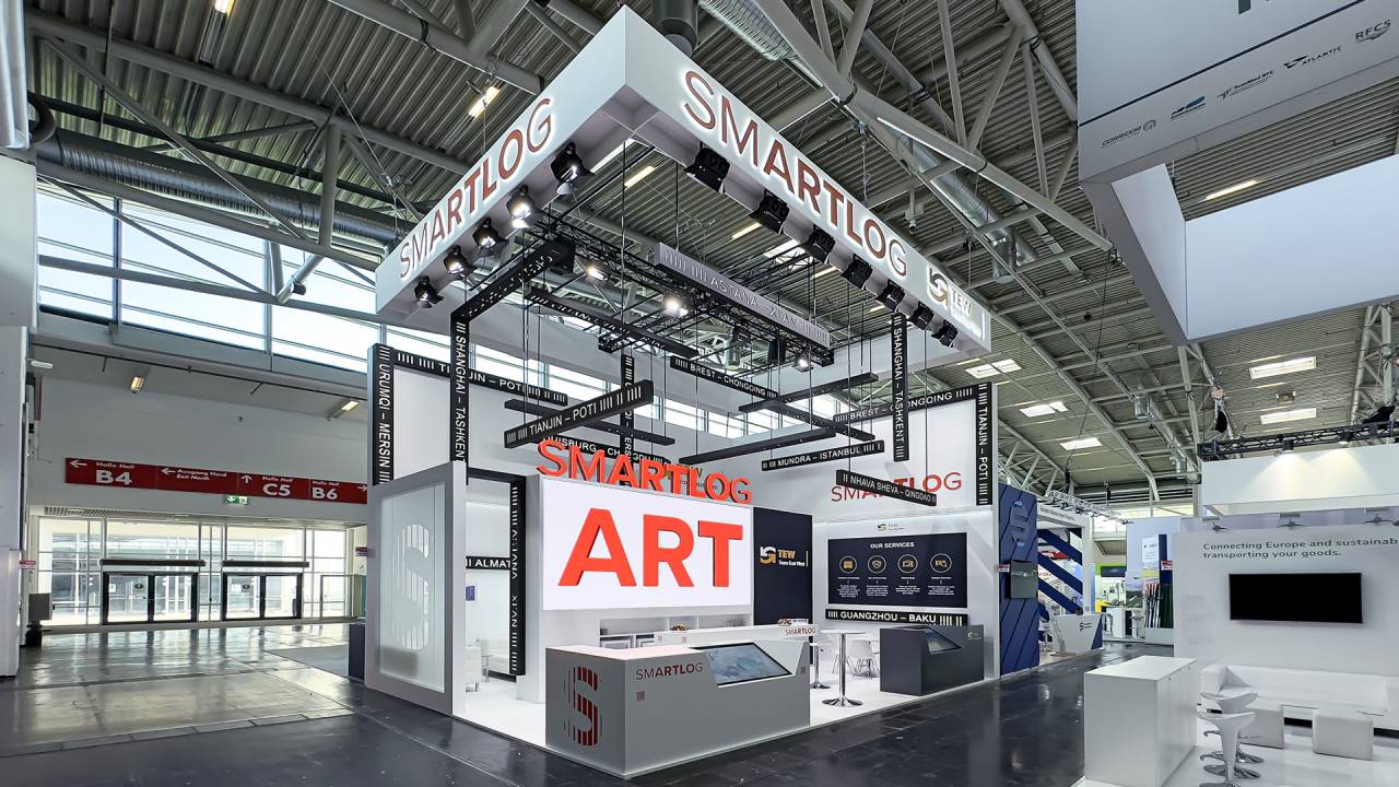
The SMARTLOG exhibition stand brought the company’s philosophy to life through the architectural metaphor of “logistics as art”, transforming chaotic routes into a precisely structured system.
A sharp black-and-white design emphasized precision and technology, while signature colors served as visual markers. The stand balanced stability and motion, demonstrating how SMARTLOG optimized global logistics.
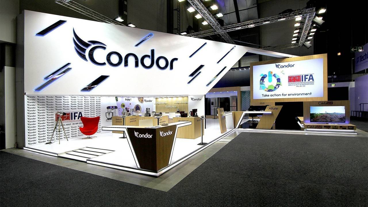
The Condor stand reflected the brand’s spirit, drawing inspiration from its symbol and representing flight and dynamic growth. A striking wing-like structure supported the logo and shaped the overall design.
Mirror-like diagonal inserts resembled feathers, enhancing a sense of lightness and speed. The wing connected key zones, from a large digital screen to an interactive display area, reinforcing the high-tech atmosphere.
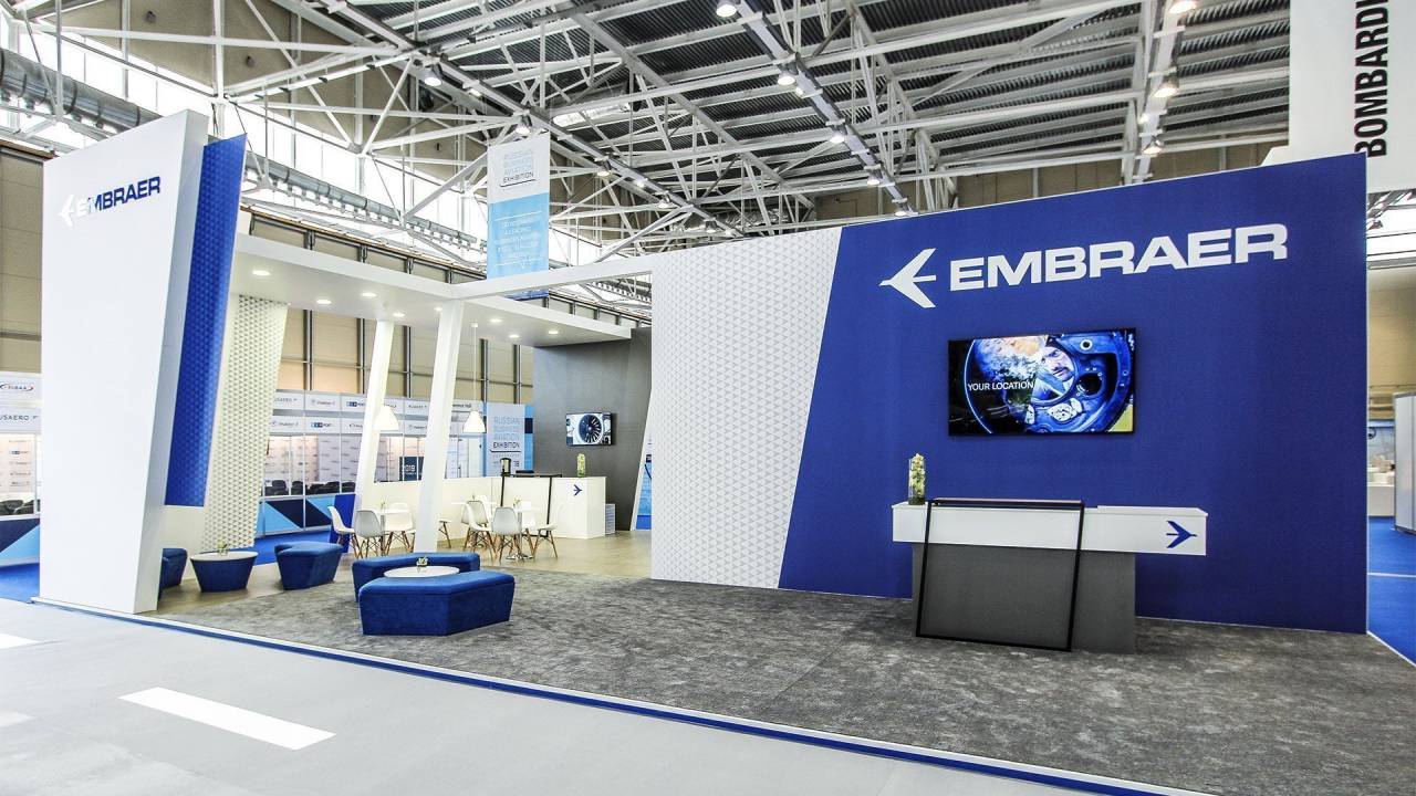
Embraer’s booth was designed as a refined platform for professional dialogue and high-level interaction. Open meeting areas and a private meeting room supported presentations, discussions, and direct engagement with industry experts.
Clean architecture, strong branding, and structured zoning created a calm, premium environment, reinforcing Embraer’s leadership and commitment to innovation, quality, and the future of business aviation.
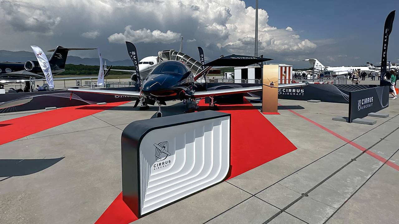
Cirrus Private Jets were showcased on the outdoor static display at Geneva Airport, creating a striking and accessible presentation of the latest aircraft models. The open setting enhanced visibility and encouraged direct engagement.
A thoughtfully designed layout allowed seamless exploration of exterior and interior features, delivering an elegant experience that emphasized design, performance, and functionality.
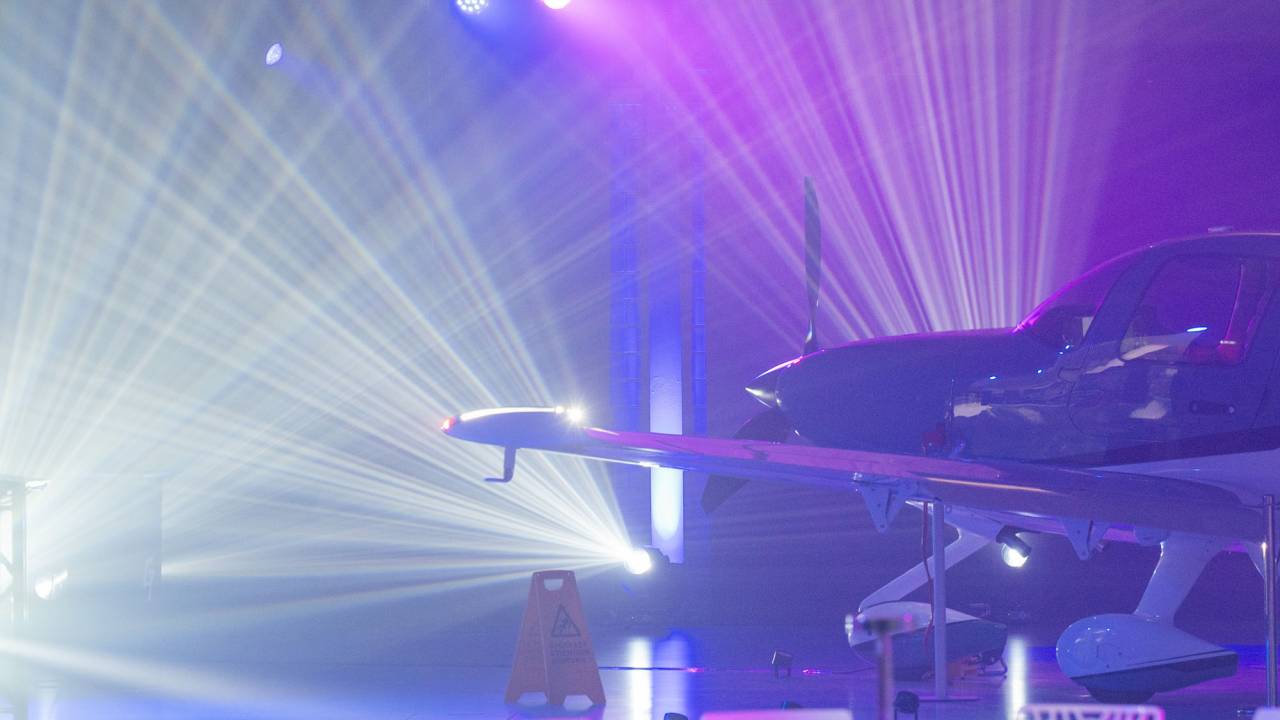
Efficient staging, lighting, and sound design created a seamless and impactful event environment, ensuring clarity, comfort, and a strong visual presence throughout the experience.
The presentation of the new avionics system was tailored for Cirrus aircraft owners and VIP guests, offering a focused and engaging introduction to the latest advancements and key features.
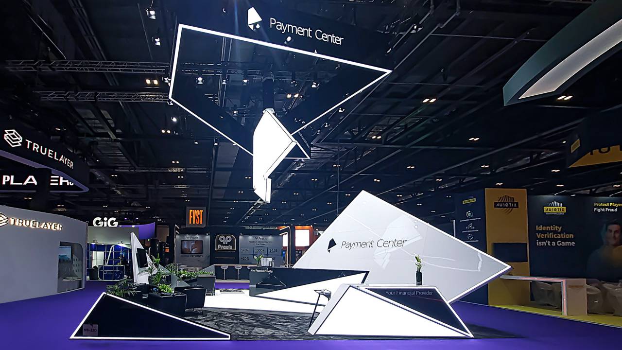
The architectural concept of the Payment Center stand was inspired by the company’s logo, which was transformed from a 2D design into a striking 3D structure, resembling a folded banknote and creating a strong visual centerpiece.
Smart design, a strong connection to the brand’s identity, and sharp geometric lines made the stand both functional and innovative, boosting its visual impact.
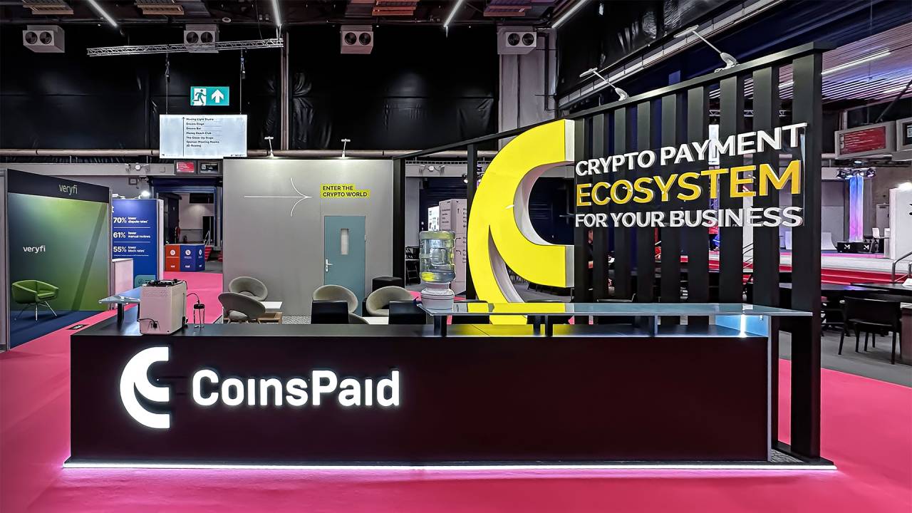
CoinsPaid’s booth was designed as a high-impact business hub, combining bold branding with functional clarity. A striking yellow architectural element and clear messaging positioned the brand as a gateway into the crypto economy, capturing attention on a competitive show floor.
The space supported meaningful conversations with an open lounge, reception area, and private meeting room, creating a seamless journey from first contact to in-depth discussion.
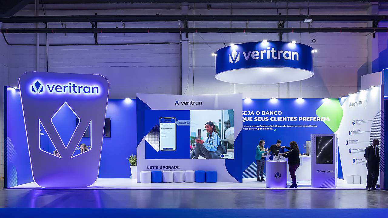
Veritran’s booth brought digital banking to life through real user journeys, demonstrating how its low-code platform enables fast, scalable solutions. Interactive screens and live demos simplified complex processes, making innovation tangible for visitors.
A bold, high-visibility design and structured layout supported engagement and dialogue, positioning the stand as a hub for showcasing technology, connecting with industry players, and exploring the future of financial services.
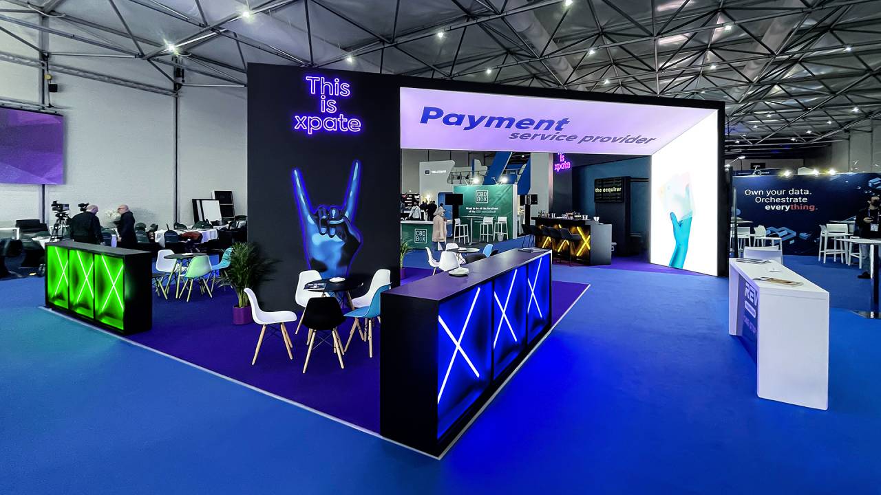
Xpate’s booth delivered a bold, immersive brand experience, combining striking neon elements with a clean architectural layout to attract and guide visitors. Open zones and a central bar created a natural flow for networking and informal meetings.
Large-scale visuals and clear messaging highlighted fast, scalable payment solutions, reinforcing the brand’s focus on simplicity, speed, and seamless global transactions.
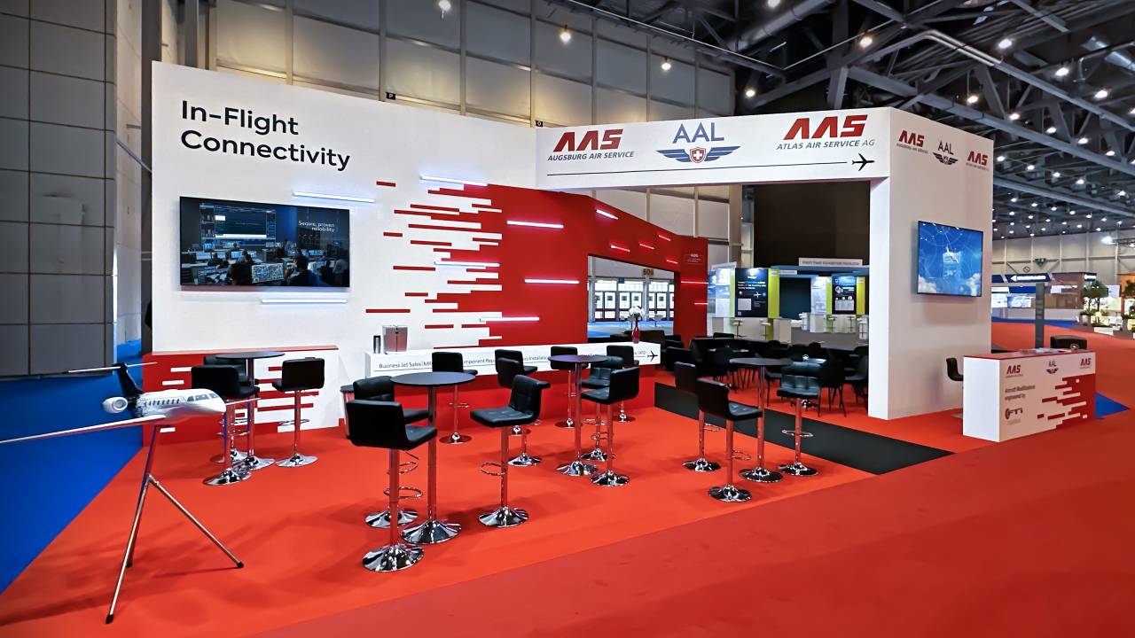
The Atlas Air Service stand featured a clear spatial structure organized around a central aisle marked by a dark path, guiding visitors through key zones. A vibrant bar area supported open networking, while a semi-private lounge was framed by freestanding arches.
A CNC-milled feature wall, inspired by aircraft livery patterns, served as the main visual highlight, while overhead branding unified the space into a cohesive architectural concept.
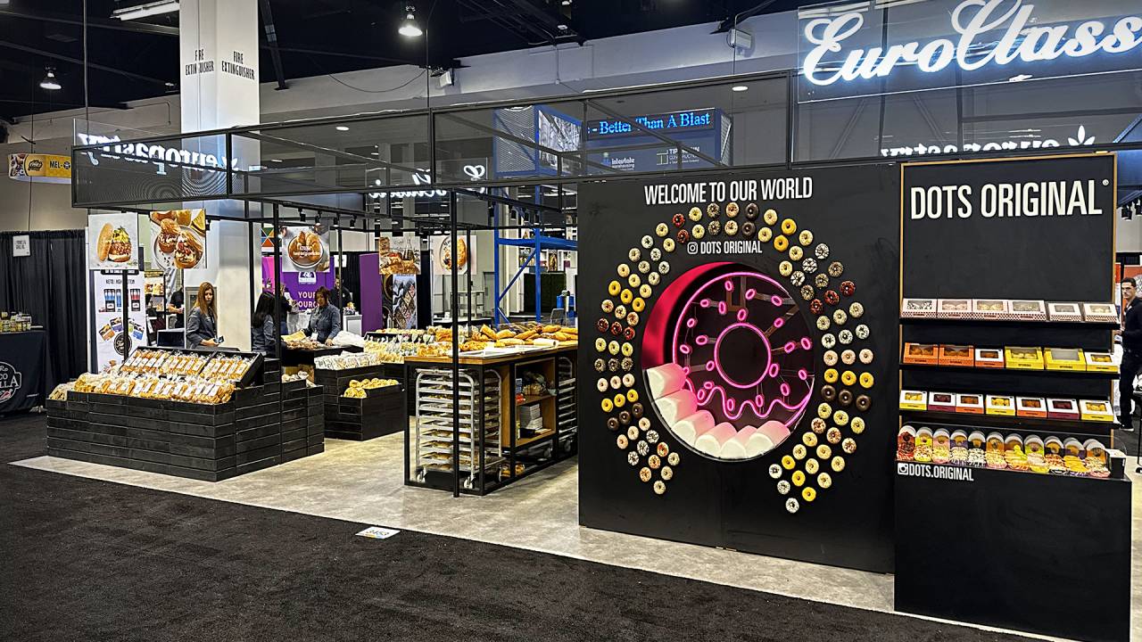
Europastry’s booth was designed as an immersive product showcase, bringing its portfolio to life within a vibrant, market-style setting. Open displays and live preparation zones invited visitors to experience quality, freshness, and craftsmanship firsthand.
A bold DOTS feature wall created a strong visual anchor, while updated branding unified the space, reinforcing the company’s identity and commitment to innovation, engagement, and sensory-driven experiences.
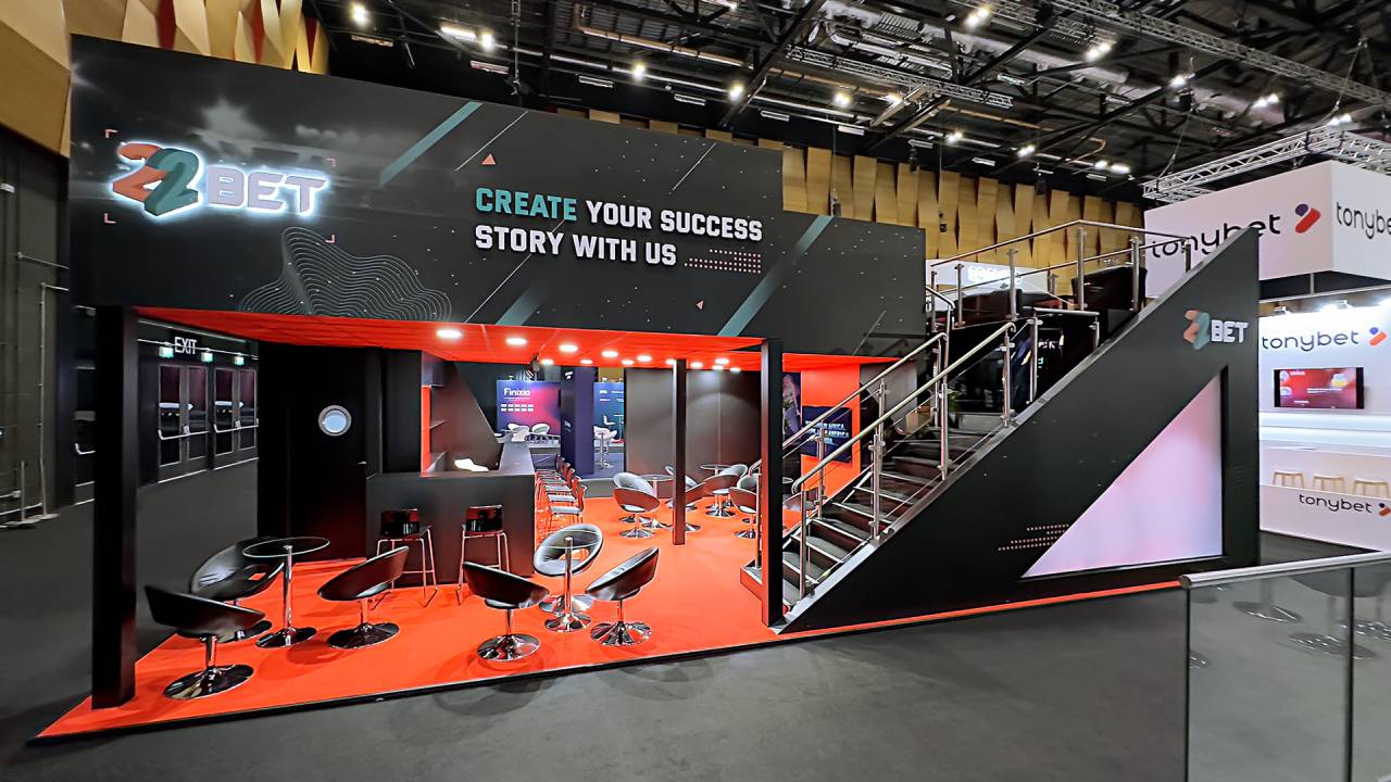
22Bet’s booth stood out with a bold, architectural design that combined sharp geometry with a strong visual identity. The two-level structure created clear zoning, balancing open networking areas with more private meeting spaces.
Striking red and black contrasts, integrated media, and confident messaging reinforced the brand’s dynamic positioning, attracting attention and encouraging engagement in a highly competitive environment.
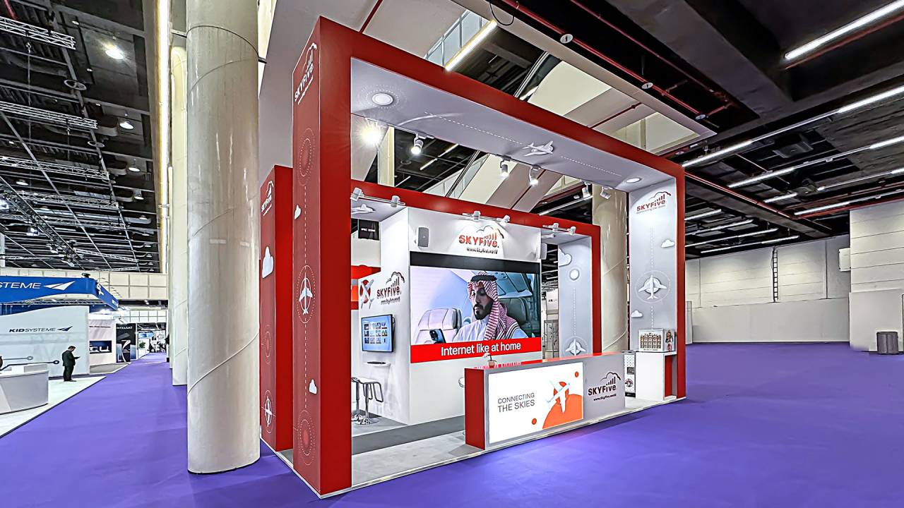
SkyFive AG showcased inflight connectivity solutions through an aviation-inspired stand defined by red-and-white framing and portal structures. Aircraft graphics and clean lines reinforced the brand’s focus on broadband connectivity and its crossover between aviation and mobile communications.
A central screen and reception counter anchored the space, while meeting rooms enabled focused discussions. The layout guided visitors through key touchpoints, supporting engagement with SkyFive’s A2G connectivity solutions.
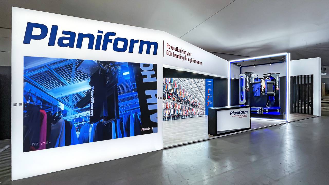
Planiform’s booth delivered a clear and confident presentation of its garment handling expertise. Clean architecture, bold branding, and large-scale visuals highlighted operational efficiency and innovation.
A dedicated product showcase zone drew attention to GOH technology, while the open layout supported seamless interaction. The stand effectively communicated Planiform’s commitment to smart, flexible solutions and customer-focused performance.
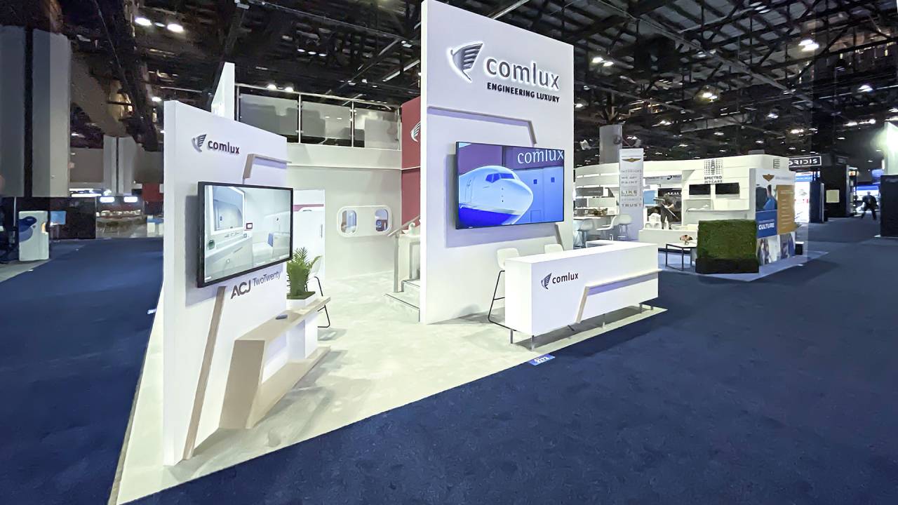
Comlux Aviation’s booth embodied refined luxury through a clean, architectural design and a restrained color palette. Large-format visuals of aircraft interiors and exteriors reinforced the brand’s focus on premium aviation experiences and meticulous attention to detail.
Open meeting areas and integrated media screens supported both presentation and dialogue, creating a welcoming yet exclusive atmosphere that reflected Comlux’s commitment to personalized service, precision, and excellence.
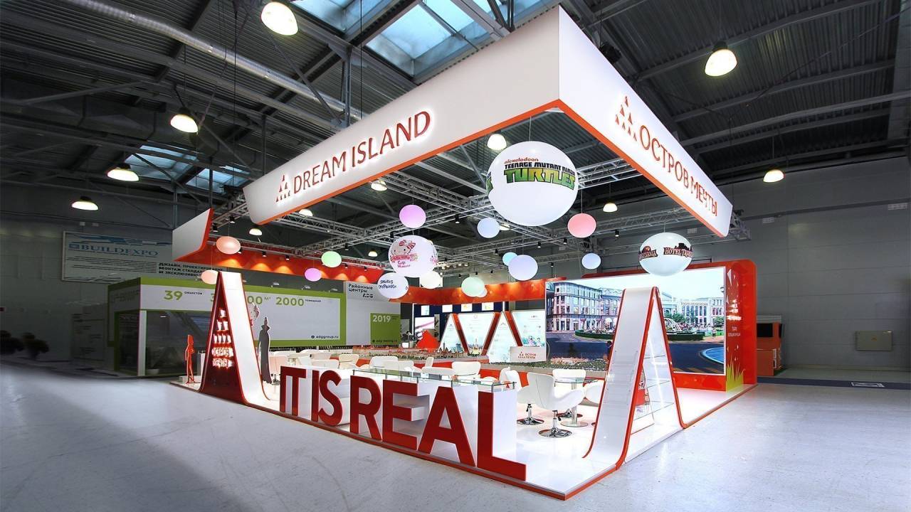
Dream Island presented an immersive, entertainment-driven stand that transformed the space into a vibrant destination. Bold red-and-white architecture, playful suspended spheres, and iconic characters created a lively atmosphere, while large-scale visuals and a detailed central model showcased the project’s scale and diversity.
The open layout encouraged interaction, while the statement “IT IS REAL” reinforced the brand’s vision—turning imagination into a tangible experience.
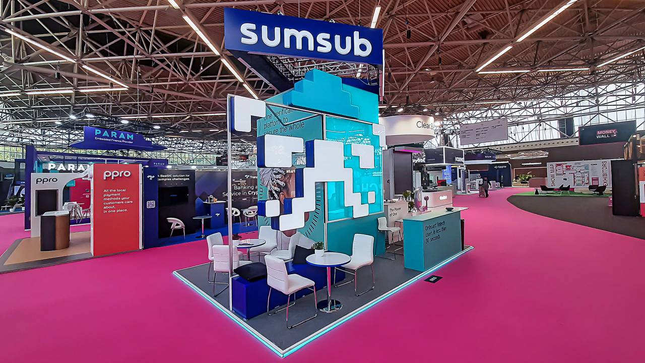
Sumsub showcased a dynamic, future-focused stand built around clarity and speed. A central illuminated structure with layered digital elements visually translated the idea of a seamless verification flow, while bold messaging reinforced efficiency and trust.
Clean meeting zones encouraged conversations, creating a space that balanced technological sophistication with a welcoming, business-oriented atmosphere at the heart of the fintech scene.
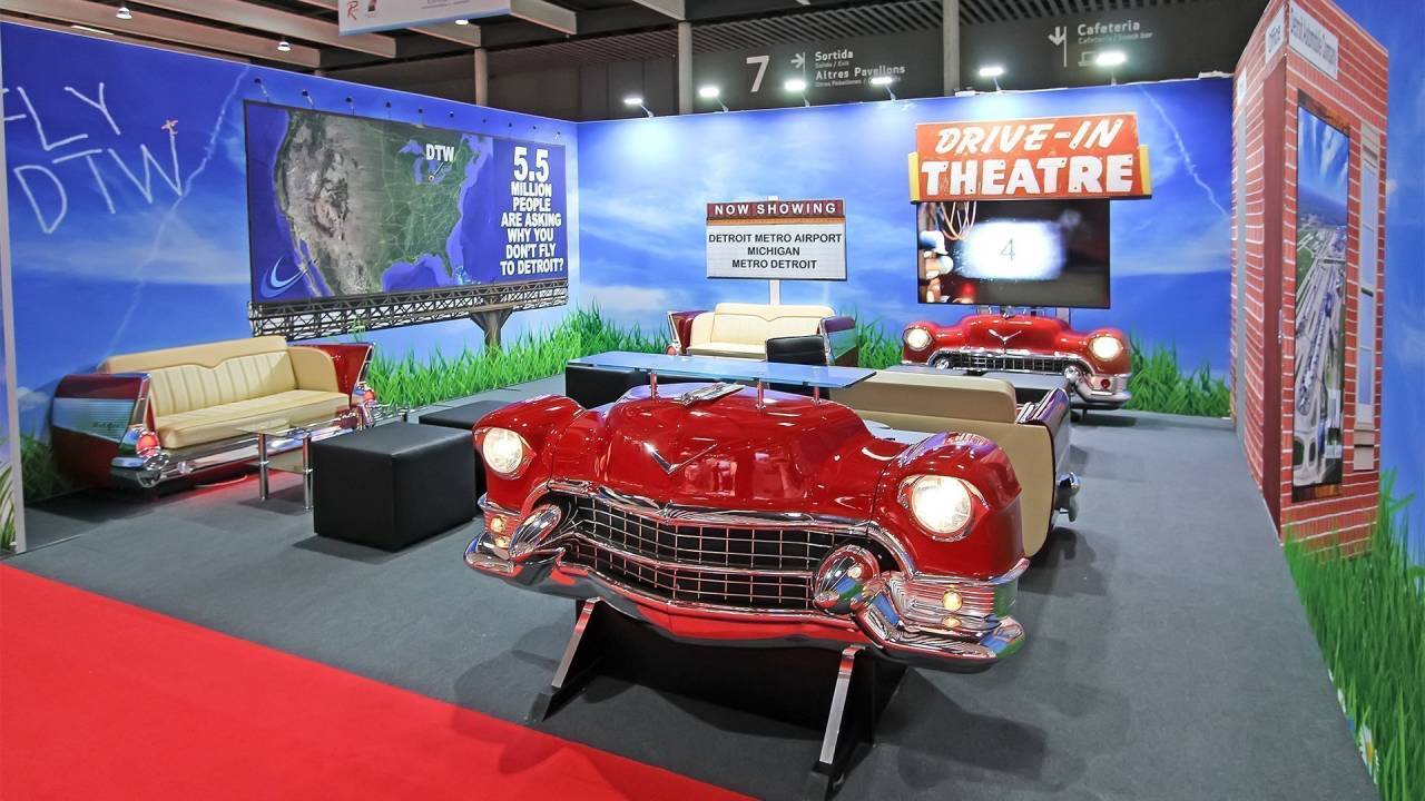
An exclusive and innovative concept was designed specifically for the iconic car manufacturing city of Detroit, celebrating its rich automotive heritage. Real classic car furniture was used as a central piece of art, seamlessly integrating authentic automotive elements into the stand design.
A thoughtful layout highlighted the classic car furniture, creating an engaging and memorable environment while enhancing the overall visual impact of the stand.
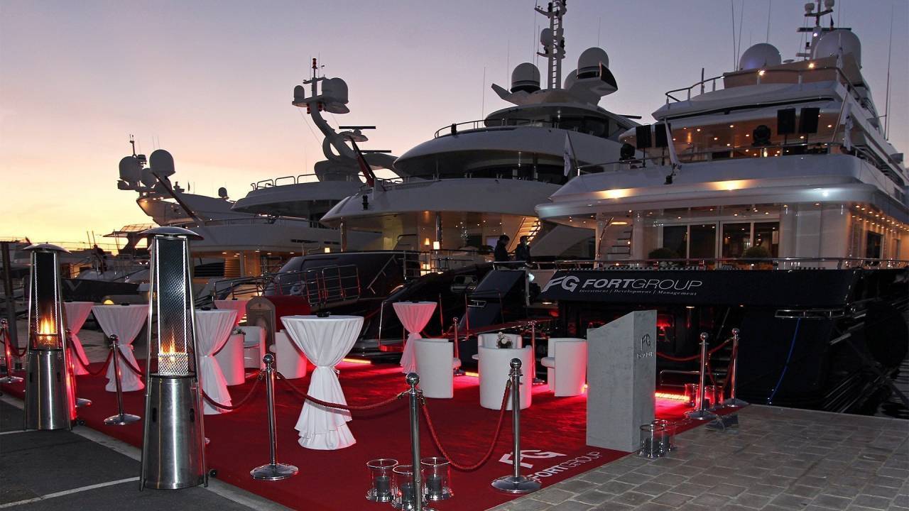
Exquisite dock and motor yacht decoration created an opulent and inviting atmosphere for the afterparty. Stunning visual design elements transformed the yacht into a luxurious venue, perfectly suited for an exclusive celebration.
A high-energy dancing afterparty featured live entertainment and a sophisticated ambiance, keeping guests engaged. A premier luxury catering service offered a gourmet dining experience with a refined selection of high-quality dishes and beverages.
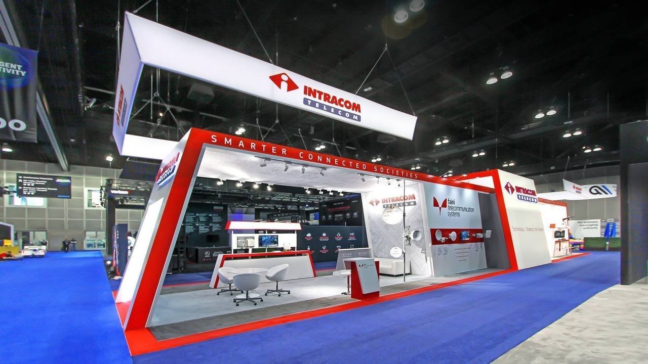
Intracom Telecom presented its innovations through a bold stand defined by strong architectural lines and a striking red-and-white color scheme. A suspended overhead structure enhanced visibility, while integrated displays and product zones communicated advanced wireless, AI, and smart city solutions.
The layout encouraged engagement through demo areas and meeting spaces, creating a professional environment that reflected technological leadership and facilitated meaningful business interactions.
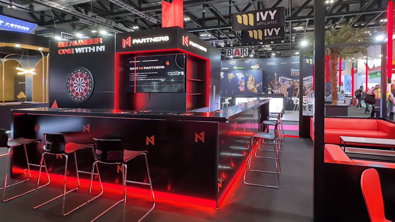
N1 Partners presented its brand through a bold, high-contrast stand defined by a black-and-red palette and strong geometric forms. A central bar-style counter and integrated screens created an energetic focal point, reflecting the spirit of the iGaming industry.
The space fostered personal interaction, emphasizing an individual approach and meaningful connections. Open meeting areas supported engaging conversations, reinforcing the brand’s focus on building mutually beneficial partnerships.
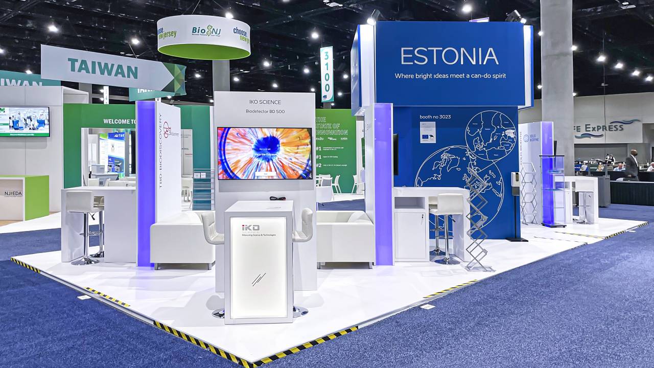
The Estonia pavilion was designed as a clean, open platform for networking within the global biotech community. The structured layout combined multiple meeting zones and presentation points, supporting intensive one-to-one interactions and knowledge exchange.
A bold central cube with clear branding ensured strong visibility, while integrated screens and light accents enhanced communication, creating a professional environment for partnerships and innovation dialogue.
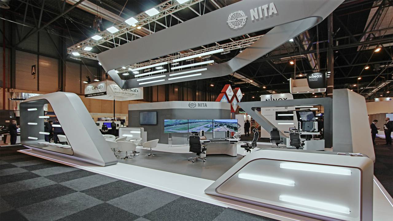
A futuristic exhibit design at a high-tech industry exhibition showcased cutting-edge innovation and advanced technology.
The stand structure seamlessly incorporated the exhibitor’s air traffic equipment, combining functionality with a refined, modern aesthetic. Interactive and immersive elements engaged visitors, effectively demonstrating the equipment’s capabilities in a dynamic and compelling way.
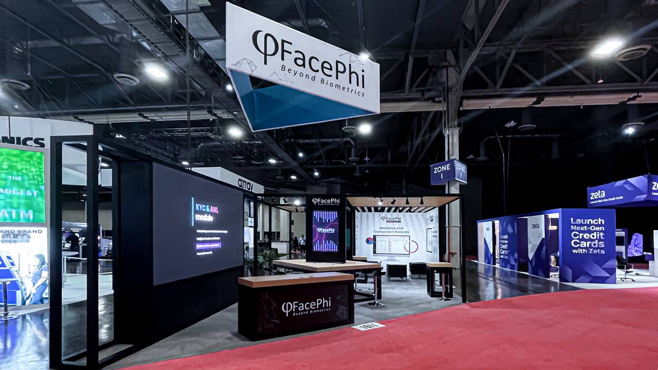
The FacePhi stand featured a clean, technology-driven design reflecting innovation in digital identity and security. Open architecture and suspended branding ensured strong visibility, while structured zones supported meetings and product demonstrations.
Integrated digital screens and interactive touchpoints showcased verification solutions, delivering a clear presentation of secure, seamless identity technologies for the evolving fintech landscape.
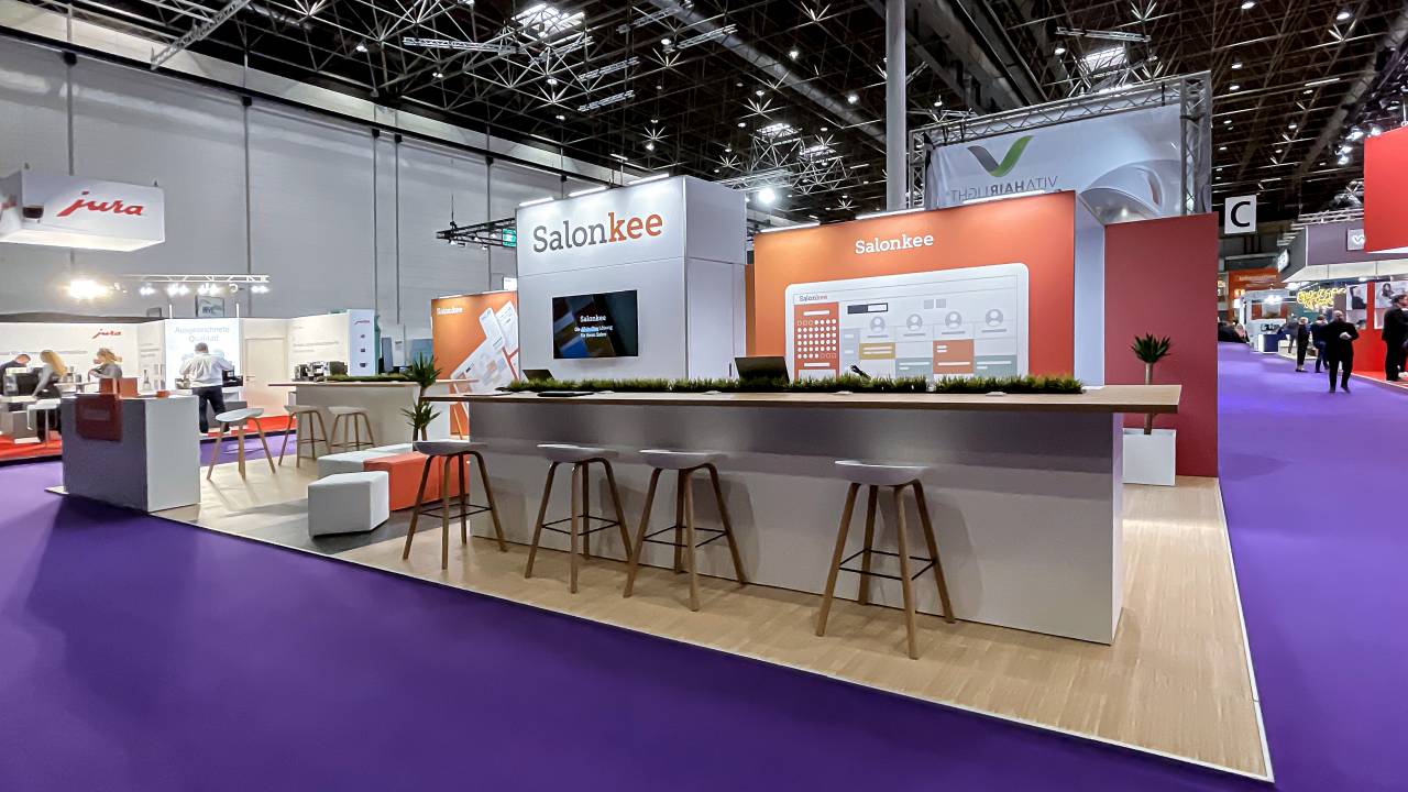
A modern stand for Salonkee at Top Hair clearly communicated the brand’s approach to simplifying and improving everyday salon operations.
Clean architecture, warm textures, and open meeting areas encouraged effortless communication, while integrated screens highlighted key platform features. The space combined functionality with comfort, creating an inviting hub for salon professionals exploring efficient, all-in-one business solutions.
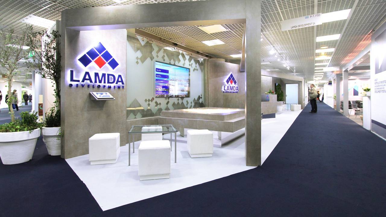
The stand for LAMDA Development at MIPIM presented the brand in a clear and professional way, highlighting its role in large-scale real estate projects.
Clean geometry, stone-like textures, and integrated scale models created a structured, premium environment. Digital displays helped present information clearly, while dedicated meeting areas created a comfortable space for focused conversations and business discussions.